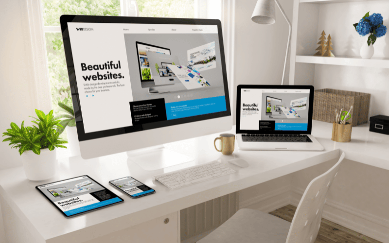
One Website, Every Device
Responsive design ensures your website adapts to all screen sizes—from large desktops to small smartphones—without compromising experience. In today’s digital ecosystem, where users switch between devices constantly, responsive design is non-negotiable.
A responsive site is faster, easier to maintain, and provides a consistent experience across platforms.
The Benefits of Responsive Design
✅ Works on All Devices
Whether it’s a laptop or a phone, your site will look and work perfectly everywhere.
✅ Better User Experience
Responsive layouts improve readability, navigation, and engagement on any screen.
✅ Improves SEO
Google prefers responsive websites and rewards them with better rankings.
✅ Simplifies Management
One site to update, one design to maintain—responsive design is efficient and future-ready.
✅ Increases Conversion Rates
Responsive sites adapt to how users browse, removing barriers and encouraging action.
One Design, Many Possibilities
With responsive design, you meet users where they are—on any device, any time. It’s flexibility without compromise.
Final Thoughts: Be Ready for What’s Next
At Zilion Nexus, we create modern, responsive websites built to perform across all platforms—giving your brand a professional, scalable edge.
“Responsive design ensures your site is always ready—on every device, for every user, every time.”